How To Create Brand Guidelines—Complete Guide
Most brands waste months of design work with one critical mistake.
They skip creating proper brand guidelines.
Without clear guidelines, your carefully crafted logo appears in seventeen different sizes across social media.
Your brand colors drift from what you originally chose.
Your typography gets replaced with whatever font was easiest to find.
Six months later, your brand looks like it was designed by five different people.
At Marlo Studios, after working with 100+ brands, we’ve learned what works and what doesn’t.
This guide shows you exactly how to build brand guidelines that are effective and everything you need to include in them.
What to Include in Your Brand Guidelines
Mission, Vision, and Values
Mission, vision, and values form the strategic foundation that should guide every design decision you make.
Your mission explains why the brand exists today, your vision defines where it's heading, and your values establish how it operates.
Together, these elements create the North Star for your brand identity, informing everything from logo design to color palette selection to messaging strategy.
Learn more about defining mission, vision, and values →
Brand Archetypes
Brand archetypes give your brand a recognizable personality that audiences instinctively understand.
Based on Carl Jung's universal character types, these 12 archetypes—from the Innocent to the Creator—help humanize brands and create emotional connections.
By selecting the right archetype, you provide a clear framework for how your brand should look, feel, and communicate across all touchpoints.
Learn more about brand archetypes →
Brand Tone of Voice
Your brand's tone of voice determines how it communicates with its audience through words.
This verbal personality should align with your visual identity and remain consistent across all platforms.
Using sliding scales of tone (formal to friendly, serious to playful, etc.), you can define a distinctive voice that makes your brand memorable and builds trust with your audience.
Learn more about brand tone of voice →
Primary Logo
Your primary logo is the cornerstone of your brand identity and the face your audience encounters first.
It typically combines your full brand name with a distinctive icon or symbol, allowing for instant recognition in a single glance.
This complete brand signature takes center stage on key materials like websites, packaging, and marketing materials where space isn't limited.
Learn more about creating a primary logo →
Secondary Logo
Your secondary logo serves as the adaptable alternative to your primary logo.
It retains core elements but in a simplified or rearranged format that thrives in constrained spaces like business cards, email signatures, and social media profiles.
This streamlined version maintains brand recognition while fitting comfortably in smaller formats where your full logo might not work effectively.
Learn more about secondary logos →
Logo vs Icon
Understanding the difference between logos and icons helps you create a more flexible brand identity system.
While your logo serves as the complete brand signature, your icon represents the most simplified version of your brand mark.
Icons work in tiny spaces where even your secondary logo would be illegible, like favicons, app icons, and social media profile pictures.
Learn more about logo vs icon differences →
Exclusion Zone
An exclusion zone is the designated negative space surrounding your logo that keeps other elements at a safe distance.
This protective boundary maintains your logo's visibility and impact across all applications by preventing other design elements from crowding too close.
Apply a consistent 0.5x measurement rule based on your icon size to create the perfect amount of breathing room.
Learn more about exclusion zones →
Logo Misuse
Logo misuse hurts brand recognition and makes your business more forgettable.
Common mistakes include placing dark logos on dark backgrounds, light logos on light backgrounds, rotating your logo, changing its colors, breaking apart its elements, or adjusting its internal sizing and spacing.
Correct logo placement follows seven designated positions with proper exclusion zones to protect your brand recognition.
Learn more about avoiding logo misuse →
Graphic Elements
Graphic elements are the visual building blocks that extend your brand beyond just a logo.
They combine forms, lines, shapes, patterns, textures, and typography to create a cohesive visual language that works across all your brand touchpoints.
These elements add personality and depth to every piece of content you create, from social media posts to marketing materials.
Learn more about creating graphic elements →
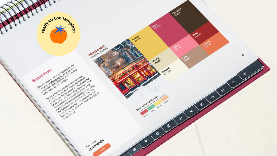
Brand Colors
Strategic brand colors connect with audiences through color psychology rather than personal preference.
Build clear hierarchy using primary, secondary, and accent colors that match your brand's tone of voice.
When you ground your choices in proven principles, your colors communicate brand personality instantly and effectively.
Learn more about brand colors →
Brand Typography
A well-planned typography system using just two fonts creates strong brand recognition.
Your serif handles personality and impact for headings, while your sans serif ensures readability and accessibility for body text.
This serif and sans serif combination creates natural hierarchy and visual contrast without adding complexity to your brand system.
Learn more about brand typography →
Packaging Design
Your packaging is often the first physical touchpoint customers have with your brand.
Good packaging design follows your brand guidelines consistently, keeps logo and text clear with proper exclusion zones, maintains brand color consistency, and designs the unboxing experience thoughtfully.
Simple, well-executed packaging that aligns with your brand positioning often performs better than expensive designs that don't fit your brand.
Learn more about packaging design principles →
Social Media Design
Social media templates prevent your carefully crafted brand identity from drifting into chaos across platforms.
Since people spend over 2 hours daily on social media, these platforms often provide the first brand impression.
Creating platform-specific templates that work within each channel's constraints ensures your brand maintains visual consistency across thousands of posts.
Learn more about social media design →
Brand Photography
Photography makes the first impression and builds trust before customers even notice your logo or colors.
Poor photography can undermine even the strongest brand strategy, while consistent photography style creates instant brand recognition and allows you to charge premium pricing.
Your photography guidelines should establish style requirements, lighting directions, and specific shot types that support your brand values.
Learn more about brand photography →
Brand Examples from Marlo Studios
Seeing these components in action helps you understand how theoretical concepts translate into real brand guidelines.
For this functional protein bar brand, we documented their playful, health-focused personality through specific color applications for each flavor.
Their guidelines show exactly how to maintain brand recognition while allowing flavor-specific variations.
The typography rules ensure their friendly, approachable voice stays consistent across packaging and social media.
This pre-loved luxury platform needed guidelines that reflected premium positioning while remaining accessible.
We documented their sophisticated color palette, elegant typography choices, and photography style that emphasizes quality and authenticity.
Their guidelines include specific rules for maintaining luxury appeal across digital and physical touchpoints.
For this protein brand, we documented their minimalist, precision-inspired aesthetic through clean typography and sophisticated color applications.
Their guidelines show exactly how to maintain premium positioning while ensuring accessibility across digital and physical touchpoints.
The design system ensures their refined, quality-focused voice stays consistent across packaging and social media.
Created for a fitness community brand, these guidelines capture their energetic, optimistic personality through playful illustrations and vibrant colors.
We documented their colorful visual system, friendly typography choices, and social media applications that reflect community spirit.
The guidelines show how to maintain brand recognition while conveying energy and approachability across all touchpoints.
Conclusion
Creating effective brand guidelines isn't just about documenting your visual choices.
It's about building a system that protects your brand from drift and ensures consistency across every touchpoint where your brand appears.
Start with your brand foundation through mission, vision, values, archetype, and tone of voice.
Build your visual identity system with logo variations, usage rules, and supporting graphic elements.
Document your design applications across colors, typography, packaging, social media, and photography.
When you cover these essential components systematically, you create brand guidelines that actually work in the real world.
To make it easy we’ve created the Brand Identity Guidelines 2.0 Template with every one of these elements included.


