7 Packaging Design Principles That Actually Work
After creating branding for over 100 clients at Marlo Studios, we've learned something important.
Most founders treat packaging as an afterthought when it should be central to their brand experience.
Your packaging is often the first physical touchpoint customers have with your brand.
Get it wrong, and you risk breaking the connection with your customers.
Get it right, and your entire brand experience is strengthened.
Here are seven packaging design principles that actually work, backed up with real examples from brands we've designed.
1—Follow Your Brand Guidelines
Your packaging design should be part of your brand guidelines from day one.
Think about it this way. You spend months perfecting your brand identity, website design, and social media aesthetic.
Then your product arrives in a plain brown box that looks nothing like your beautiful brand.
You've just destroyed the experience you worked so hard to create.
When packaging follows the same visual rules as your other brand elements, customers immediately recognize your products.
This recognition builds trust and makes customers more likely to buy again.
2—Make Your Logo and Text Clear
Your logo needs to be clearly visible on your packaging. Customers should know it's your product at first glance.
Always include an exclusion zone around your logo. This applies whether you're using your primary logo, secondary logo, or icon.
The exclusion zone prevents other elements from crowding your logo and losing its impact.
Text must be legible and properly sized.
This becomes especially important with food products where you need to include nutritional information and other legal requirements.
3—Keep Brand Colors Consistent
Your brand colors need to match across digital and physical touchpoints.
When customers see your packaging, they should immediately connect it to their previous experiences with your brand online.
This means using the same colors as your website, social media, and marketing materials.
Consistent colors also help your products stand out on crowded shelves or in shipping boxes.
Customers can spot your brand among competitors because they know exactly what to look for.
For help creating memorable brand colors, check out our complete color guide for designers.
4—Keep the Design Simple
Simple packaging design focuses customer attention on the key information you want them to see.
Complex designs with too many elements confuse customers and dilute your message.
You can still incorporate graphic elements that reflect your brand personality. Just avoid overdoing it.
Every element should serve a purpose and support your overall brand message.
5—Design the Unboxing Experience
Your packaging is part of the customer journey that starts the moment they receive your product.
The unboxing experience can make or break their first impression of your brand.
A well-designed package creates anticipation and excitement. It makes customers feel like they're receiving something special, not just another online purchase.
Premium unboxing experiences don't require expensive materials.
Smart design choices like custom tissue paper or branded stickers can make a huge impact.
6—Plan Budget for Packaging
Every client we work with has different budget constraints for packaging.
Some founders choose simpler designs to keep costs manageable. Others invest in extra packaging like custom influencer boxes.
Both approaches can work if they align with your brand positioning and business goals.
Be honest about your constraints and design accordingly.
A simple, well-executed package often performs better than an expensive design that doesn't fit your brand or budget.
7—Test Your Packaging Before Launch
Before committing to large production runs, test your packaging with real customers or focus groups.
Get feedback on readability, functionality, and overall appeal.
Does the packaging communicate your brand message clearly? Is it easy to open? Does it protect the product during shipping?
Small adjustments at the testing stage can save you thousands in reprinting costs and prevent customer satisfaction issues.
Real Marlo Client Examples
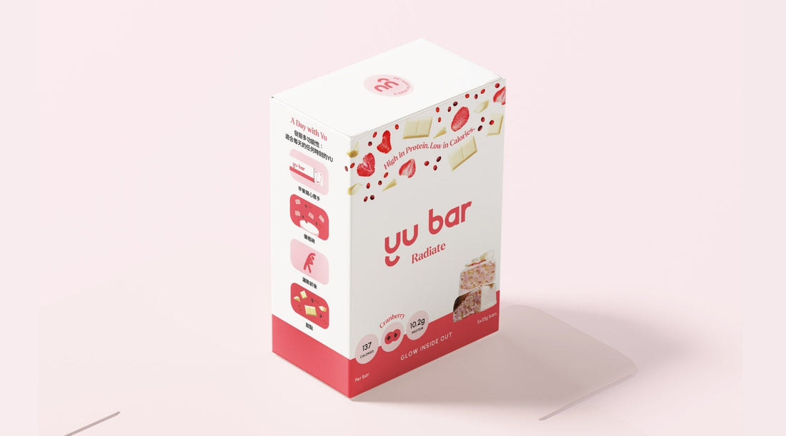
Yu Bar—Functional Protein Bar
For this functional protein bar brand, we designed packaging that extended their brand messaging across multiple flavors like Cranberry and Peanut Butter.
We created a strategic color coding system for different flavors while maintaining strong brand recognition.
Each flavor had its own color but used consistent typography and layout structure.
We also developed an influencer box featuring brand elements like custom stickers and graphics.
This gave Yu Bar a premium unboxing experience that aligned with their aspirational lifestyle positioning.
MYMIKA—Pre-Loved Luxury Platform
This pre-loved luxury platform needed packaging that reflected their premium positioning.
We designed clothing labels, branded stickers, and shipping boxes that featured their brand colors and logos consistently.
The unboxing experience reinforced MYMIKA's commitment to quality and attention to detail.
Every element felt intentional and premium, from the moment customers received their package.
Love, Audley—Makeup Remover Sets
We designed packaging for this makeup remover brand's cotton pad sets, including detailed product labels that communicated the brand's clean beauty positioning clearly.
Dermessa—Clean Beauty Brand
For Dermessa, we designed clean shipping boxes featuring their logo to maintain brand recognition throughout the customer experience.
Conclusion
Good packaging design isn't about following every trend or using the most expensive materials.
These seven principles work because they focus on what actually matters to customers.
Clear communication, visual consistency, and thoughtful design choices that create a memorable experience.
Our Brand Guidelines 2.0 Template includes everything you need to maintain consistency across all your brand touchpoints, including packaging design.


