Brand Colors—Designer's Complete Guide
Most designers think choosing brand colors is about personal preference.
They're wrong.
Your favorite color might be the worst possible choice for the brand you're designing, and there's a scientific reason for that.
In this article, you'll learn how to choose brand colors that actually connect with your audience, build proper color hierarchy, and create tones that make your designs work across every touchpoint.
What Makes Brand Colors Actually Work
Creating brand colors that actually connect with your audience starts with understanding color theory.
Most designers skip this step and jump straight to picking colors they like. That approach fails because your brand colors need to work harder than just looking good.
Understand Color Psychology
Color psychology reveals why some combinations feel trustworthy while others trigger anxiety. Johann Wolfgang von Goethe's pioneering research showed that colors create subconscious emotional responses within milliseconds.
Here's how it works in practice.
When you walk into a luxury spa, the muted grays and soft blues instantly signal relaxation. A fast food restaurant's bright reds and yellows communicate energy and speed.
Your brain processes these signals before you're even conscious of them.
This means your color choices should align with the emotions you want customers to feel about your brand.
Ask yourself: What feeling do you want to create? Trustworthy and professional? Energetic and fun? Calm and luxurious?
Your colors should answer that question immediately.
Match Your Brand's Tone of Voice
Your brand colors should also match your brand voice.
Think about it this way. If your brand were a person speaking, what would they sound like? Friendly and approachable? Professional and trustworthy? Bold and energetic?
Your colors need to communicate that same personality.
For example, a financial company would lean toward navy blues and grays to convey stability and trust, whereas a wellness brand might choose soft greens and earth tones to suggest natural healing.
Create a Clean Color Hierarchy
To create a successful brand color system, you need to understand how colors work together in a hierarchy.
Primary colors are your main brand colors. These appear most frequently and carry the heaviest branding load. Think of them as your brand's signature. They're the colors people will remember you by. Usually 1-3 colors maximum.
Secondary colors support your primary colors. They add depth and flexibility to your palette while maintaining brand consistency. These give you more options for different design needs while staying on-brand. Typically 3-6 colors.
Accent colors are used sparingly for highlights, calls-to-action, or special emphasis. Think of them as your brand's punctuation marks. Usually 2-4 colors.
Your complete palette should contain 6-13 colors total. Any more becomes chaotic. Any fewer limits your design flexibility.
This hierarchy ensures your brand colors work together harmoniously instead of competing for attention. Without proper hierarchy, your brand looks chaotic and unprofessional.
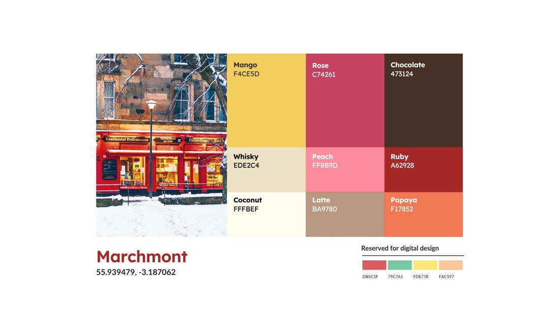
Real-World Example—Marlo’s Chocolate

When we designed a chocolate brand concept called Marlo's Chocolate, we needed colors that would immediately communicate warmth, comfort, and quality.
We used a nature-inspired color palette called Marchmont from Command+i. The colors were chosen specifically to create a nostalgic, comforting feeling that matches perfectly with chocolate.
The key is being intentional about every color choice. Each color in your palette should have a reason for being there.
When someone sees your brand colors, they should immediately get a sense of who you are and what you stand for, even before they read a single word.
Understanding Brand Tones
Now let's talk about tones. This is different from your brand colors, and many designers confuse the two.
Brand tones are your neutral color system. They range from white to black. While your brand colors express personality, tones handle the practical side of design.
Tones create a consistent neutral foundation that ranges from white to black. They ensure your text and logo stay readable and your design looks professional across every touchpoint, whether that's your website, social media, or packaging.
Think of tones as the supporting cast that lets your brand colors be the star. They provide contrast and hierarchy without competing for attention.
Your tone system should have at least five variations between white and black. This gives you enough options to create proper hierarchy in your layouts while maintaining consistency across all touchpoints.
Using Marlo's Chocolate as an Example Again

For text on dark backgrounds, we use the lightest tone (neutral 1 #FDFDFD) for maximum readability.
For text on light backgrounds, we have more flexibility. Neutral 4 (#474747), neutral 5 (#292929), or neutral 6 (#000000) all work well depending on how much contrast is needed.
The goal with tones is to create enough contrast so people can read your content without straining their eyes. Poor contrast kills user experience faster than any design trend.
To make it easy, think of it this way.
Your brand colors make people feel something. Your tones make sure they can actually read and use your materials to get that feeling.
Conclusion
Strategic brand colors connect with audiences through color psychology rather than personal preference.
Build a clear hierarchy using primary, secondary, and accent colors, then create systematic tones that ensure readability across all touchpoints. When you ground your choices in proven principles, your colors communicate brand personality instantly and effectively.
Our Brand Identity Guidelines 2.0 template helps you document professional color systems with hierarchy definitions, tone applications, and usage guidelines.
Get the Brand Identity Guidelines 2.0 template here and turn your color palette into a complete brand system.


