Logo Misuse—Don’t Make These 6 Mistakes
Your logo might be working against you.
In a world where people see thousands of brands daily, every misplaced, poorly contrasted, or incorrectly sized logo makes your business more forgettable.
When your logo appears correctly, recognition strengthens. But when it doesn't, you lose ground to competitors who get the details right.
In this article, we'll show you six common logo misuse mistakes and how to fix them using practical examples.
Why Logo Application Matters
Your logo appears everywhere your brand does, yet most businesses treat it like an afterthought.
Every time someone sees your logo placed correctly, their brain builds a stronger connection to your brand. When they see it misused, that connection weakens.
The psychology behind logo recognition works through repeated exposure and consistency. Your brain creates neural pathways that link visual elements to memories and emotions.
When your logo appears the same way across different touchpoints, these pathways strengthen. When it varies wildly in placement, color, or format, the brain struggles to form lasting associations.
The financial impact of logo misuse often goes unnoticed until it becomes severe. Poor logo application creates brand dilution, where your visual identity becomes so inconsistent that customers struggle to recognize you.
This leads to decreased brand recall, reduced customer loyalty, and ultimately lost revenue opportunities.
Throughout this article, we will show you six examples of logo misuse and how to fix it using Marlo's Chocolate, a chocolate brand we created for our Brand Identity Guidelines 2.0 Template.
6 Common Logo Misuse Mistakes
The six mistakes below appear in almost every brand identity project we encounter. Each one damages your brand's visual impact and makes it harder for customers to recognize you.
Understanding these common errors helps you spot them before they appear in your marketing materials.
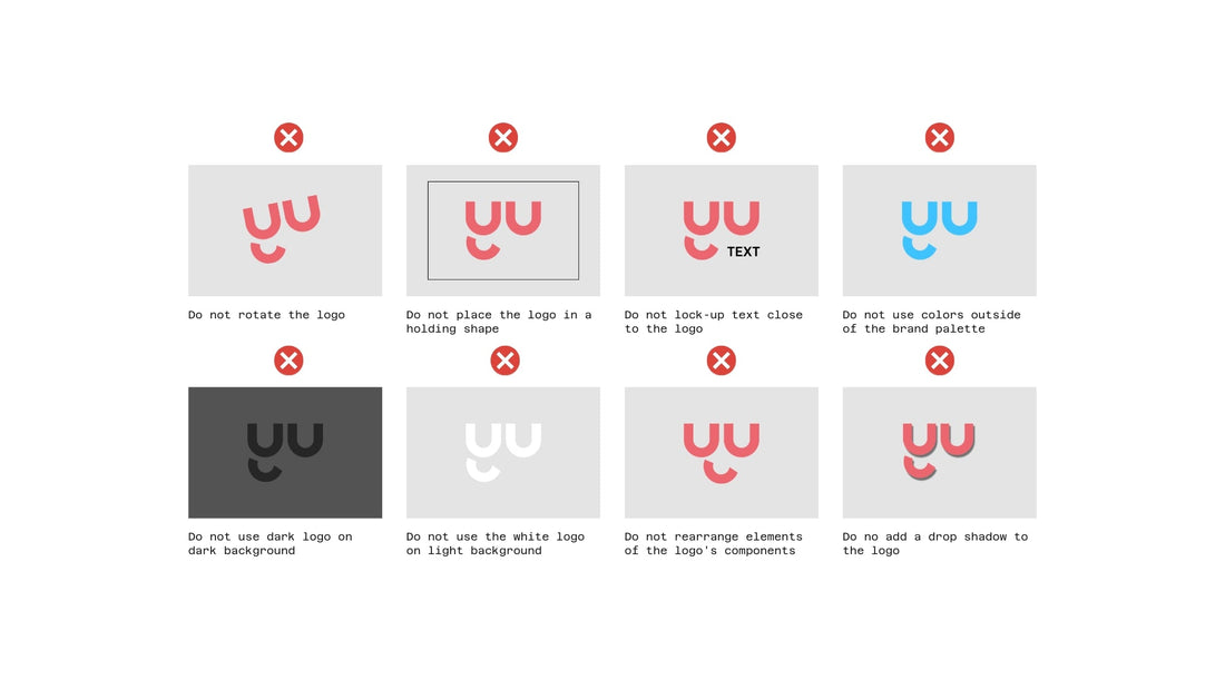
1—Dark Logo on Dark Background
Your logo disappears when it blends into dark backgrounds.
This happens more often than you might think, especially on websites with hero images or social media posts with moody photography.
Your logo needs sufficient contrast to remain visible and readable. When your logo blends into the background, viewers can't process your brand information, making the entire communication ineffective.
2—Light Logo on Light Background
Light logos vanish against pale backgrounds just as easily.
White or pale logos vanish against cream websites, light gray packaging, or bright social media backgrounds.
The human eye needs contrast to distinguish shapes and text. Without this contrast, your logo becomes invisible, regardless of how beautiful the design might be.
3—Rotating the Logo
Rotating your logo destroys its carefully planned proportions and readability.
Designers create logos to work at specific angles, typically horizontal orientations. When you tilt or rotate them, text becomes harder to read and visual elements lose their intended impact.
This includes diagonal placements that might seem creative but actually harm recognition.
4—Changing Logo Colors
Changing your logo's colors breaks the visual consistency that builds brand recognition.
Your brand colors create emotional connections and help customers identify you instantly. When you swap these colors for seasonal themes, personal preferences, or design convenience, you weaken these associations.
Customers start seeing multiple different brands instead of one consistent identity.
5—Breaking Apart Logo Elements
Logo designers carefully balance logo elements like text, icons, and spacing to create unified marks.
Separating these elements, using just the icon without text, or rearranging components changes the logo's meaning and impact.
6—Adjusting Size and Spacing
Stretching text wider, making icons larger, or squeezing elements to fit tight spaces creates visual discord.
These changes make your logo appear unprofessional and can make text illegible. Your logo works best when its internal relationships remain exactly as designed.
How to Correctly Place Your Logo
Context determines where your logo belongs on any design, but this doesn't mean you can place it anywhere you want.
Seven Specific Positions
Smart brands limit their logo placement to seven specific positions. This approach maintains consistency while giving you enough flexibility for different design needs.
Your logo can appear in the top left corner, top middle, top right corner, center, bottom left corner, bottom middle, or bottom right corner.
These positions work across all your brand materials, whether digital or print. When you stick to these seven spots, customers learn where to look for your brand identifier, making recognition faster and more reliable.
Don’t Crowd Your Logo
The exclusion zone around your logo matters just as much as its position.
This invisible boundary ensures your logo has breathing room and doesn't compete with other design elements. Think of it as your logo's personal space that prevents visual clutter from weakening its impact.
Corner placements require extra attention to exclusion zones. When your logo sits in a corner, it's tempting to push it right to the edge to maximize content space. However, cramped logos look unprofessional and become harder to see.
Always maintain the minimum 0.5x logo size spacing requirements, especially in corner positions where the logo already has less visual prominence.
Conclusion
Logo misuse happens when you place dark logos on dark backgrounds, light logos on light backgrounds, rotate your logo, change its colors, break apart its elements, or adjust its internal sizing and spacing.
Correct logo placement follows seven designated positions with proper exclusion zones. These simple rules protect your brand recognition and build customer trust through consistent visual experiences.
Creating brand guidelines prevents these mistakes from happening in the first place.
Our Brand Identity Guidelines 2.0 template includes 39 editable slides that cover logo usage, color applications, typography rules, and design systems to keep your brand consistent across every touchpoint.
Get the Brand Identity Guidelines 2.0 template and ensure your logo is always applied correctly.


