Brand Typography—2 Fonts Every Brand Needs
After building 100+ brands for clients, we've refined our approach to typography to a system that just works.
In this article, you'll discover how to create effective typography systems using only two fonts, when to introduce a third font, and real examples of brands we've designed.
Why Typography Matters in Design
Typography makes up nearly 90% of most websites, making it the primary visual element your audience encounters.
Your font choices communicate brand personality before anyone reads a single word. A confident serif suggests expertise and tradition, while a clean sans serif feels modern and approachable.
Professional typography systems do three things: they increase perceived brand value, build instant recognition across touchpoints, and create trust through consistency.
When customers see polished, intentional font choices, they assume the same care extends to your products or services.
The 2-Font System That Works
A serif font for headings carries your brand personality and handles all your headlines, while a sans serif font for body text ensures readability across all your supporting content.
This combination creates natural hierarchy and visual contrast while covering most of your brand communication needs without adding complexity.
The real challenge isn't the system itself. Success depends on picking the right serif and sans serif fonts that suit your brand voice and work together.
Here are a two examples of brands we’ve created to give you some ideas.
Marlo Studios 2-Font Typography Examples
For Yu Bar, we paired the serif font Larken with the sans serif URBANIST.
Larken brings natural softness and expressiveness that matches Yu Bar's approachable personality.
While URBANIST is a low-contrast, geometric sans serif inspired by Modernist typography. Its neutral design makes it incredibly versatile across both print and digital applications.
For MYMIKA, we chose the serif font Junicode paired with sans serif Aspekta.
Junicode's medieval manuscript origins give MYMIKA's luxury pre-loved platform a sense of heritage and craftsmanship.
Aspekta is a modern neo grotesque sans serif with 20 different weights and multilingual support. Its clean, simple style balances Junicode's more decorative nature.
When to Add a Third Accent Font
Third fonts add personality without disrupting your core typography hierarchy.
However, use them sparingly. Think only for social media graphics, special campaigns, or packaging details.
Your accent font should feel more like a visual element than a regular typeface. It's there for special moments, not everyday communication.
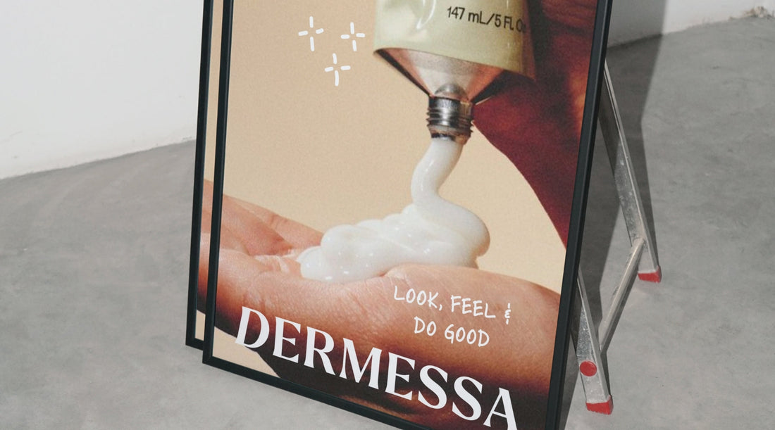
Marlo Studios Example—Dermessa
For Dermessa, we used Larken as the serif heading font and PT Sans as the sans serif body font, with Skippy Sharp as the accent font.
Skippy Sharp is a lively handwritten font with dynamic strokes that add warmth and character through its organic, personal feel. Something important for a skincare brand.
4 Typography Mistakes To Avoid
Using Too Many Fonts
Multiple typefaces create visual confusion and weaken brand recognition.
Your audience can't remember what makes your brand unique when you constantly switch between different fonts.
Using Just One Font
Using just one font for both headings and body text makes your brand appear cheap.
Without contrast between your heading and body fonts, your content lacks visual hierarchy and becomes harder to scan.
Not Matching Brand Voice
Choosing fonts without considering brand voice alignment is like wearing a tuxedo to the beach.
Your fonts need to match what your brand represents. For example, playful script font won't work for a serious financial services company.
Ignoring Readability
Prioritizing decoration over readability defeats typography's purpose.
If people can't read your content comfortably, it doesn't matter how beautiful your fonts look.
Conclusion
A well-planned typography system using just two fonts creates strong brand recognition.
Your serif handles personality and impact, while your sans serif ensures readability and accessibility.
Ready to implement your own typography system?
Get our Brand Identity Guidelines 2.0 Template to document your font choices and create consistent branding.


