Yu Bar
Putting the "Fun" in Functional with Yu Bars.
SERVICE
Brand Identity, Packaging
YEAR
2024
CREDIT
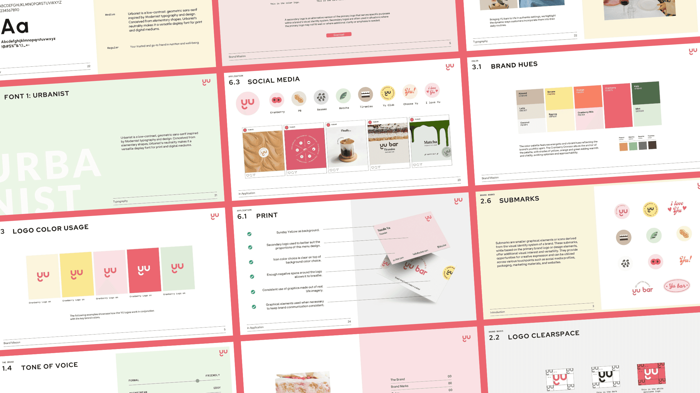
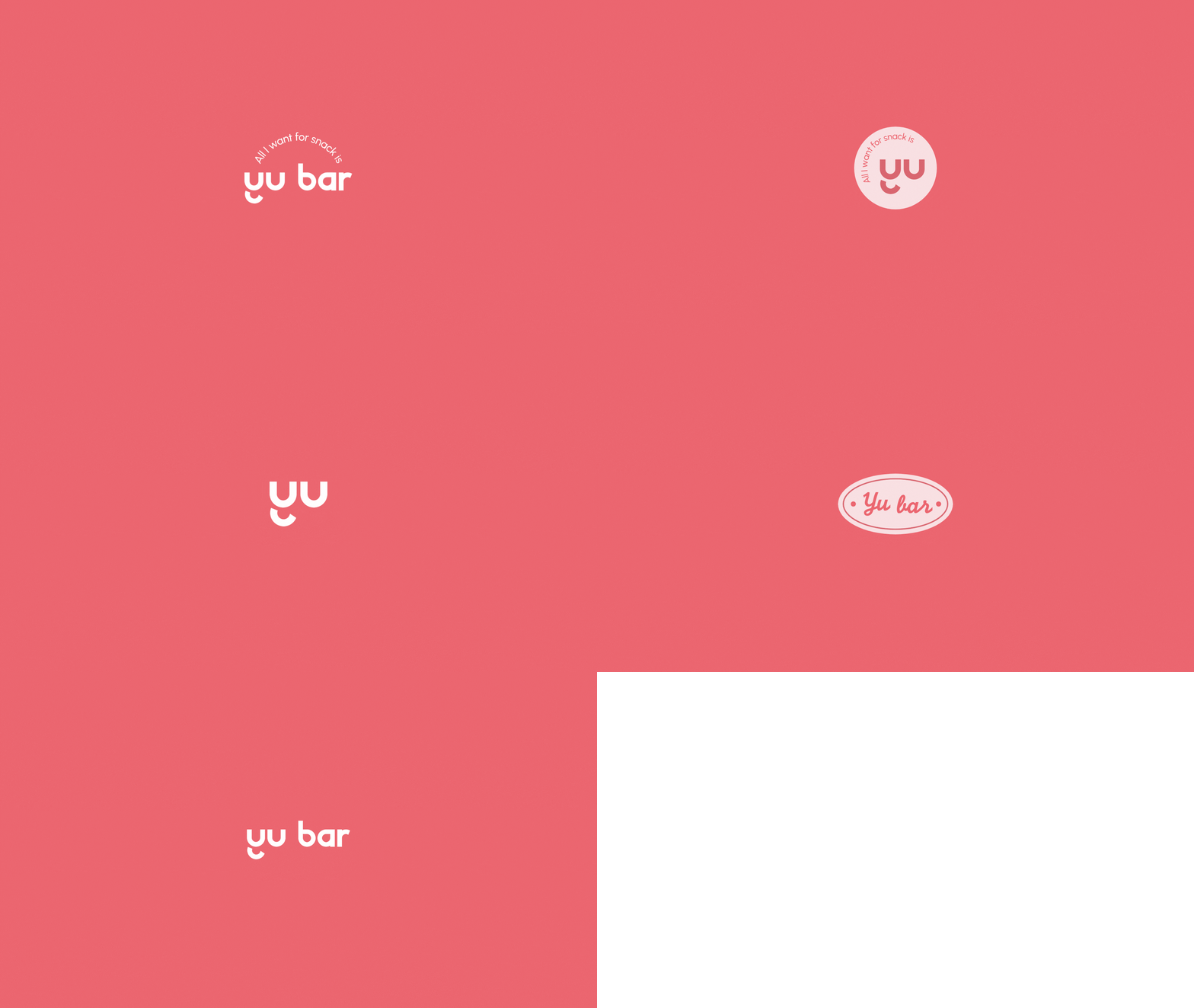
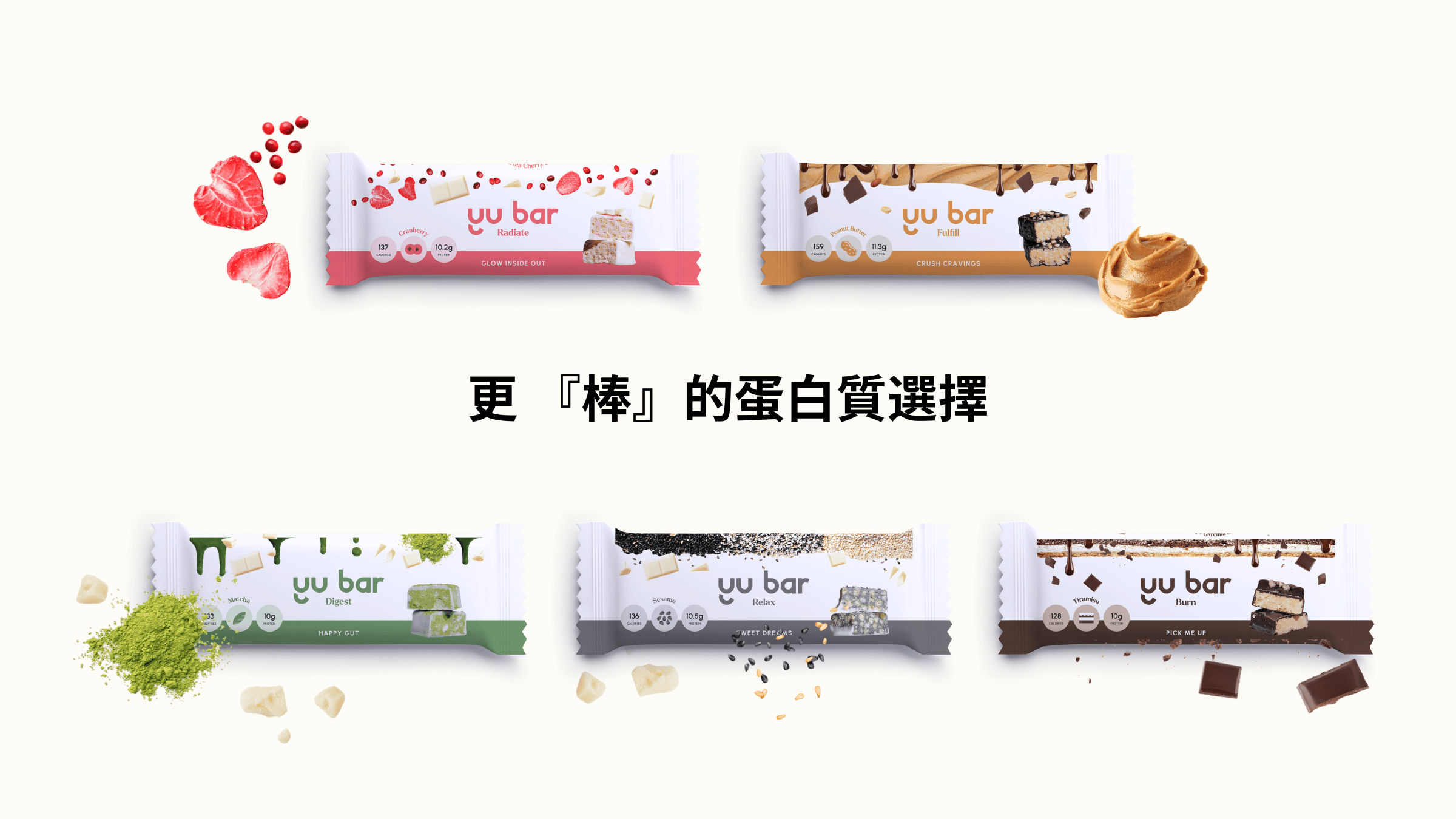
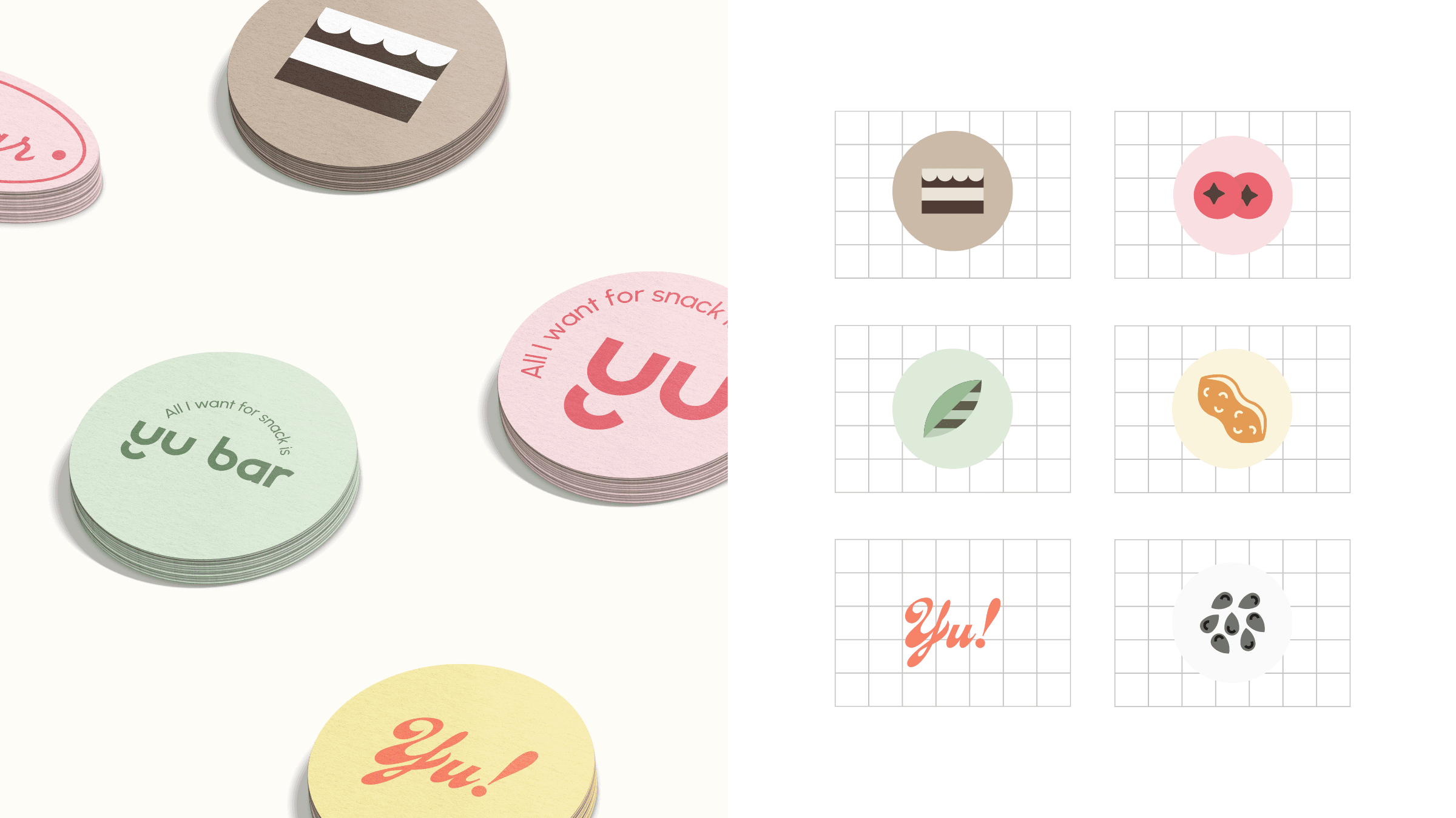
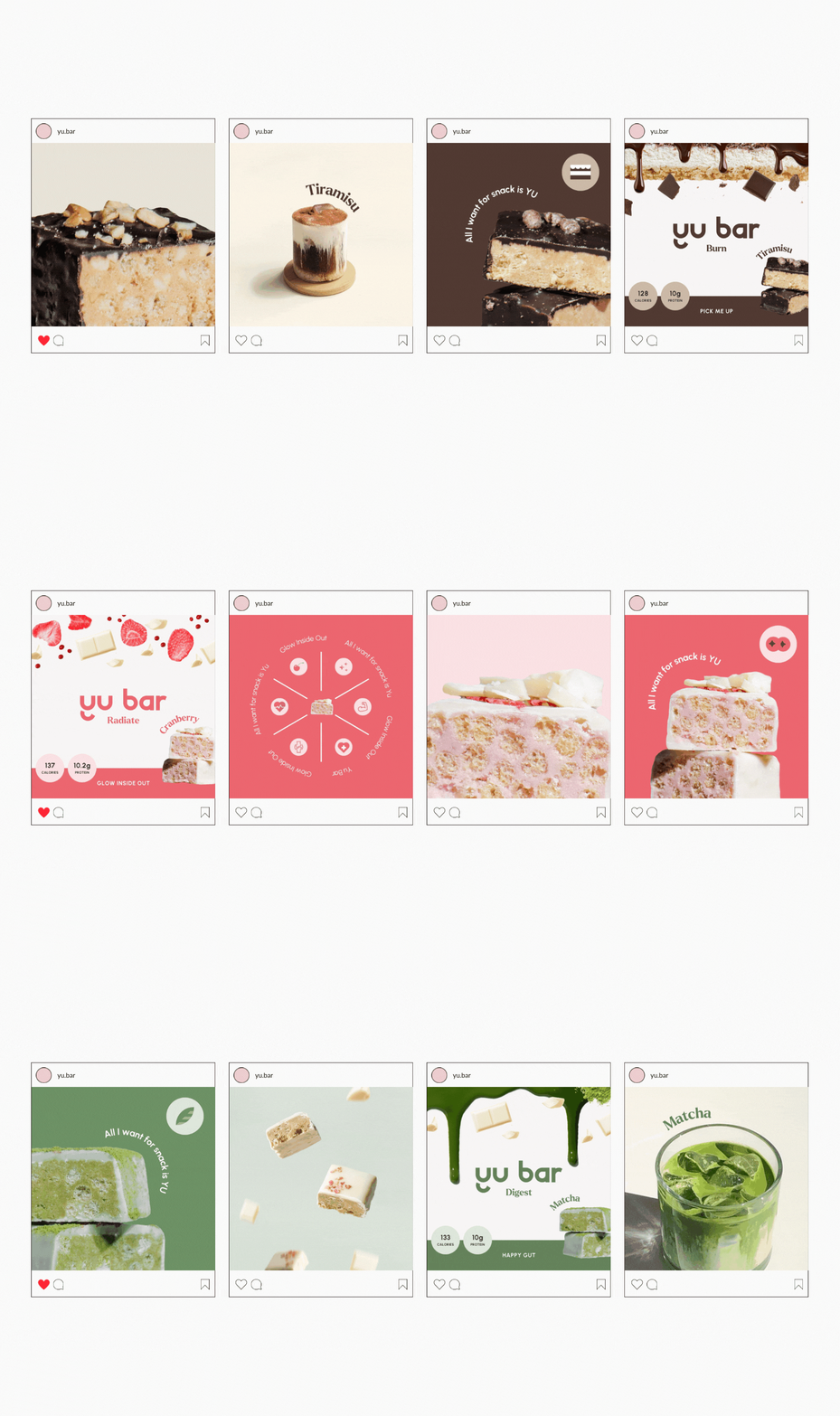
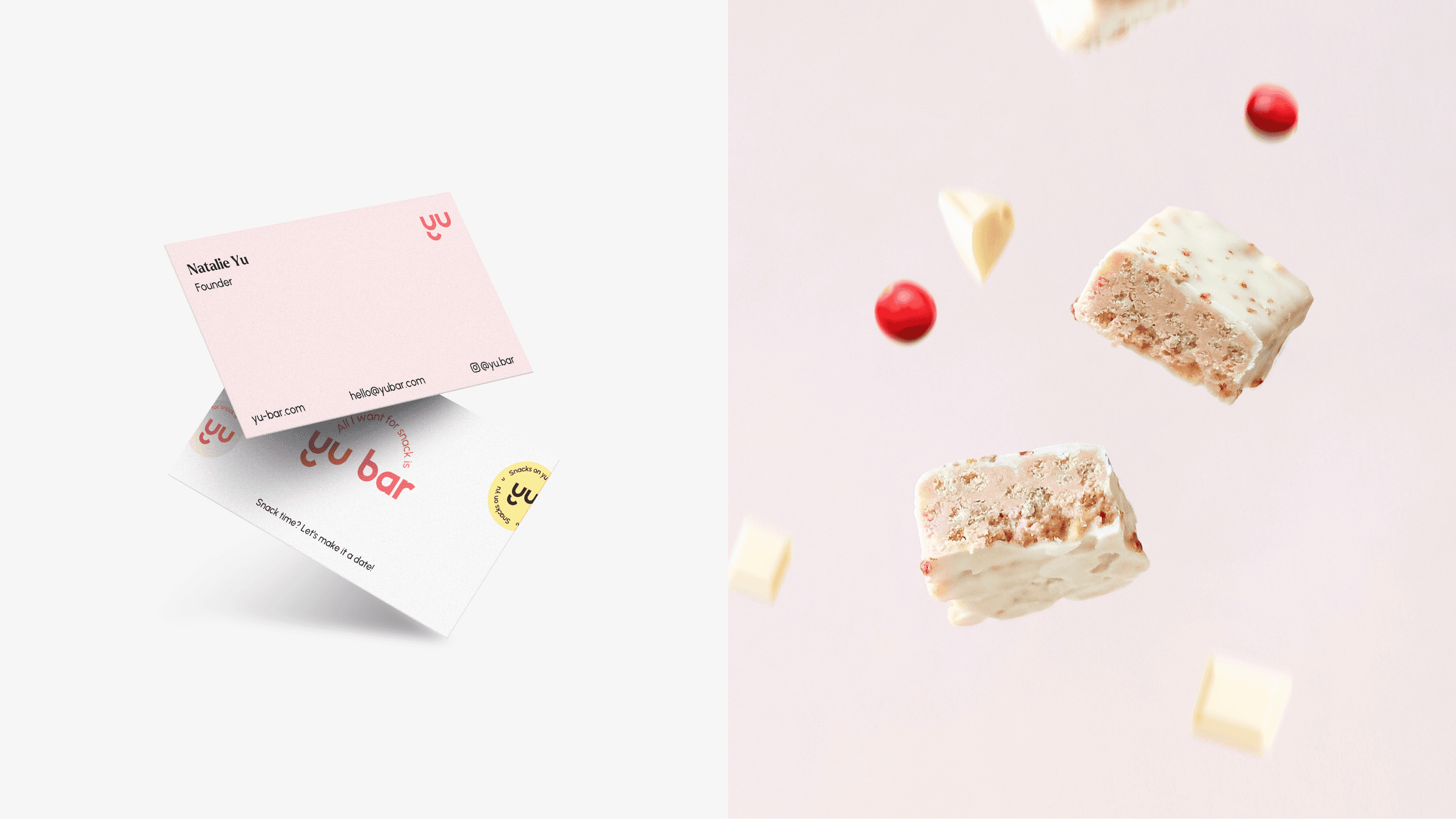
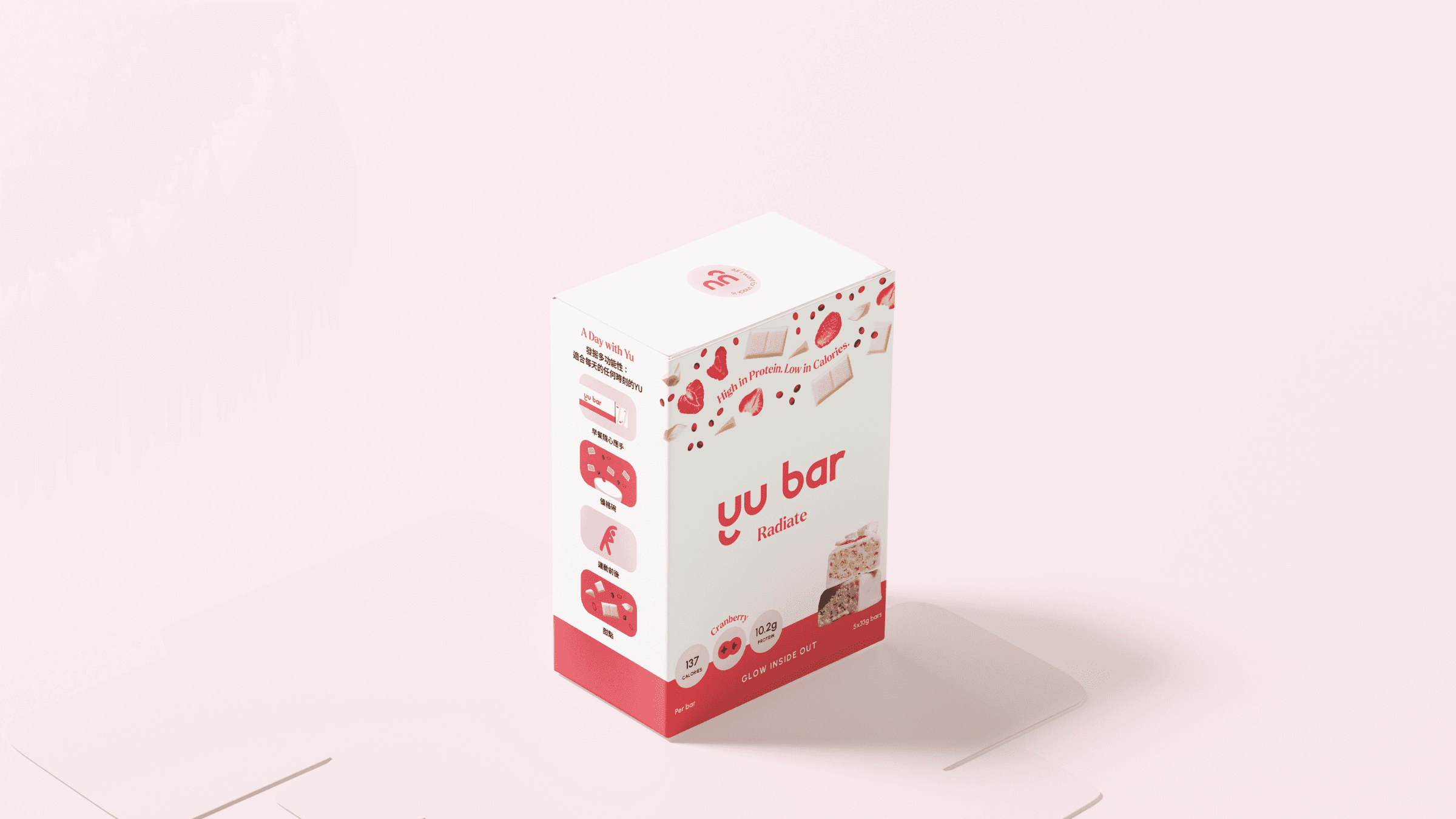
The brief was to design a brand for a functional protein bar aimed at a female demographic, representing an aspirational lifestyle. Marlo Studios developed a full brand identity for Yu’s launch, including logo design, a playful brand voice, key messaging, packaging design, art direction, and social media strategy and imagery. The result? A visual identity that puts the “fun” in functional. With phrases like “Sweet Dreams” and “Glow Inside Out,” the messaging highlights the nutritional benefits of each bar in a no-fuss, easy-to-understand way. The vibrant color palette, paired with clean typography and clear ingredient visuals, helps the flavors stand out.
